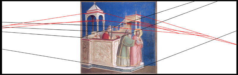
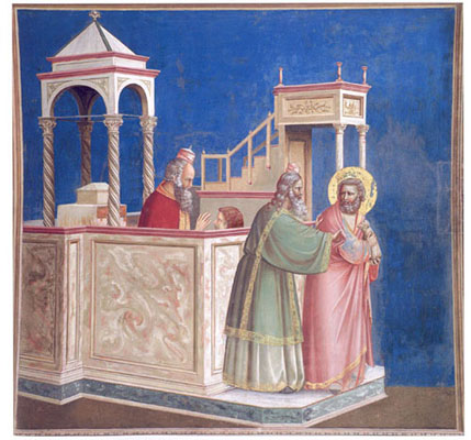
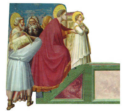
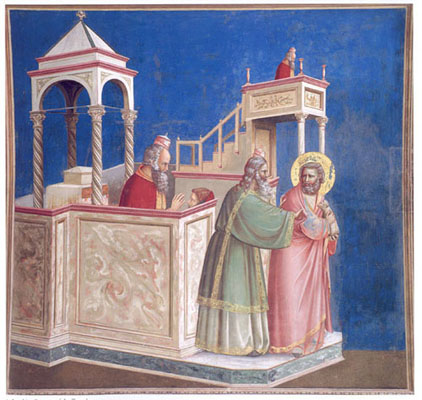
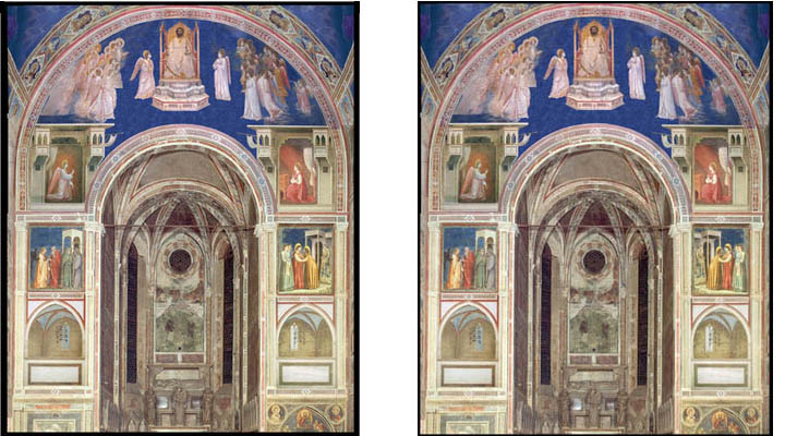
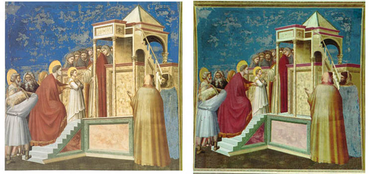
1. The Expulsion of Joachim from the Temple; click on the image for 2, the projection diagram.
Note. This paper is an updated version (7/27/04) of a presention at the (Re)Discovering Aesthetics conference at University College, Cork on July 10, 2004.
The traditional fine-grained discussions of Giotto's epoch-making frescoes are full of aesthetic observations and judgments. Those of John White1, Alastair Smart2 and James Stubblebine3 serve as examples. Yet an aesthetically engaged reader whose critical faculties have been honed by philosophical debate can't help but notice omissions, obscurities, and questionable inferences. While admiring the subtlety and insightfulness of these accounts with respect to selected features, such a reader wishes for the attribution of aesthetic properties to the works to be sharpened, extended over more features, and placed on firmer ground.Here are some examples of what I mean. Giotto's pictorial space, while undeniably more naturalistic than its precedents, is rife with inconsistencies:
1. Orthogonals and diagonals obey no consistent projection scheme;
2. Objects diminish ecccentrically with respect to distance;
3. Architectural impossibilities abound;
4. Perspectival and parallel projections are co-mingled.
The Expulsion of Joachim from the Temple exhibits 1, 2 and 4. The temple enclosure is presented in essentially parallel projection (click on the image to see the black diagonals on the diagram); the other diagonals converge, but to horizons on different elevations; and the pulpit is far too small for the indicated distance.
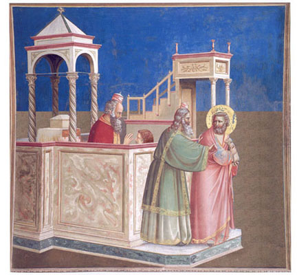
1. The Expulsion of Joachim from the Temple; click on the image for 2, the projection diagram.
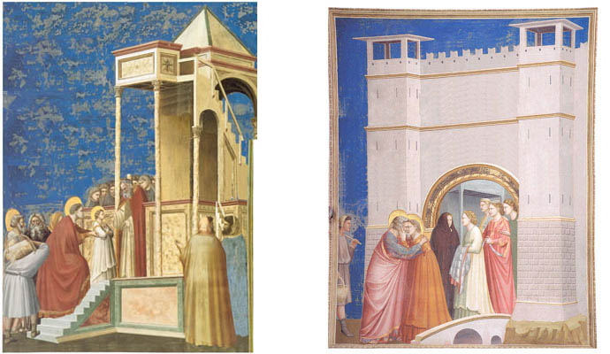
The Presentation of Mary in the Temple likewise exhibits 1and 2, and also 4. The architecture of the tower defies rationality, the near corner lacking any visible support.
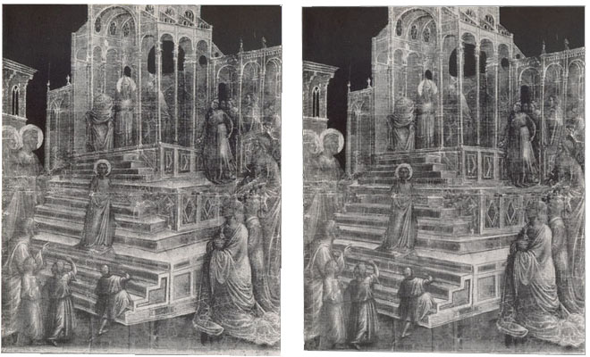
3. Giotto, The Presentation of the Virgin in the Temple. Click on image for 4, the projection diagram.
My point in calling attention to these anomalies is not misplaced literalism. Rather it is grounded in aesthetic wonder. First in wonder at the fact that such features do not undermine the generally positive aesthetic effect of the works. That they do not is implied by the reception of the works both in Giotto's day and in ours. Secondly in wonder that so little curiosity is shown by commentators as to what precisely is the aesthetic effect of the inconsistencies, and why they have the effect they do. For there is practically no systematic (let me stress systematic) discussion of the subject in the vast Giotto literature, so far as I have been able to find. Yet resolving those questions is plainly crucial to a deep understanding of Giotto's pictorial style. 4.
Perhaps one reason for the neglect is that until recently it has been difficult to gauge the effect of isolated features. One can only try to imagine them away or compare the subject picture with other pictures differing in the relevant respect. Imagination is at once frail and capricious, and contrasting paintings never present an alternative "neat," that is to say, without other differences entering into the case. Fortunately recent advances in digital technology make it possible to create fully colored and textured reproductions of the works with selectively altered features. For instance, the diagonals in the Expulsion can be regularized and the result compared with that of the original. Likewise one can modify the other anomalous features of this and other Arena Chapel works, and thereby better take the measure of the originals. On this basis one can assess the artistic advantages and disadvantages of mingling projection schemes, erratically diminishing objects with distance, converging diagonals to different horizons, and various other spatial discrepancies or ambiguities. Operating with the new data, one finds oneself thrown into something like the position of the artist pondering practical problems - which are of course aesthetic problems - of how to manage the pictorial space within the various constraints applicable to the commission. In creating the transforms, one enters into the artist's project, attaining thereby a more intimate acquaintance with the art of art.
Such topics are particularly suited to a renewed interest in aesthetics in art history. For any given work we find an aesthetically rich and specific nest of problems concerning perceptions instead of generalities. We can form specific aesthetic questions and seek answers. The flood of new data generated by the transforms serves to sharpen the ultimate arbiter of matters aesthetic, namely the well-informed and well-practiced eye, as I hope to demonstrate through the following examples found in Giotto's work in the Chapel.
1. Projection-irregularities in the architectural setting.
Diagrams alert one to projection irregularities but do not enable one appreciate the aesthetic effect they produce. Digital transforms such as the following show what Giotto might, in principle, have done, and what the aesthetic effect of that would have been. The preliminary results are somewhat surprising.
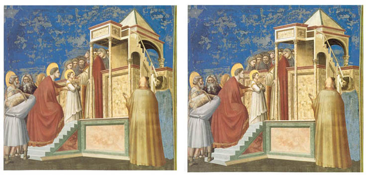
5. Transform regularizing perspective of 1, keeping POV and size of forward figures unmodified.
The modified Joachim in the first transform calms down Giotto's hyperactive space - hyperactive in presenting multiple shifts of point of view. To be sure the regularized architectural structure is still far from realistic, since the pulpit is unaccountably reduced in size relative to the enclosure and the figures. But waiving that for the moment, by viewing the transform we are better positioned to appreciate the shift in aesthetic effect and address the question of what the artistic value of Giotto's invention is. Comparing the two we can ask how exactly the regularity of the transform affects us? What artistic good in the original is enhanced or degraded? Does the irregularity of the projection in the original take anything from it that Giotto or his contemporaries would have valued? Does it take anything away from what we value in Giotto?
The loss or gain, since aesthetic, must be expressed in terms of aesthetic properties. For instance it might be alleged that the scrambled projection makes for a more coherent surface design. Consider for example the felicitously balanced divergent slants of the base and pulpit in the original. That symmetry is virtually lost when the pulpit is nearly leveled. The upward slant of the pulpit in the original also widens the void into which Joachim is propelled by the censorious priest. Granted, a correct perspectival version can retain the slant, as in the next transform (6). Is this better? But this version produces a more aggressive rush out of depth by the entire structure, an effect not likely to meet with favor among Giotto cognoscenti, e.g, John White(5).
6. Transform of 1 regularizing the perspective, preserving the upward tilt of the pulpit. POV nearer, forward figures enlarged accordingly.
The original may also conceivably be more expressive than either regularized alternative, perhaps conveying piety, which is plausibly a chief desideratum for Giotto, and for us too. Further, in its day Giotto's awkward composite was less at odds with the modes of spatial depiction it supplanted than are the regularized alternatives. Fully consistent perspective might have seemed too abrupt a shift, too dismissive of its immediate precedents. Or perhaps Giotto's mixed mode better reflects the less-than-merely-worldly character of the subject matter. Regardless of how one judges these suggestions it seems clear that the subject deserves to be explored instead of passed over, as it mostly has been all these years.
2. Misorientation of figures relative to the depicted context.
In the Presentation of Mary the figure of Anna is strikingly misorientated. She ascends a staircase lying at an angle of 30 degrees to what is called the picture plane. Yet she is orientated parallel to that plane. For her orientation to match that of the stairs, the stairs would have to be swiveled 30 degrees, as shown in the transform (7).
7. The stairs in 3 swiveled to conform to Mary's orientation.
(I have no transform regularizing her orientation in relation to the stairs in the original because I haven't felt equal to the task of redrawing her.) In this case I am fairly confident of one artistic good achieved - her orientation felicitously stresses the picture plane, helping to offset the diagonal placement of the architecture. If I am right about that advantage, what remaining questions are there about this (comparatively rare) feature? Does the orientation also have something to do with Anna's importance, signified also by her enhanced size? Or with the desire to show her face (to project that to the audience, as actors project their voice)? Unquestionably the orientation injects something artificial, unnaturalistic, into the depiction. Is that specific sort of artifice artistically good in itself, given the rest of the context?
3. Discrepancies of scale
Nothing is more obvious in the Arena Chapel pictures than the discrepancy of scale between the lower sections of the architecture, which are presented (more or less) full-size, and the upper ones, which are presented in miniature. The pulpit and staircase leading to it are disproportionately small. Why?
Left, 8. Transform of 3 with upper parts of the architecture heightened to lessen the discrepancy of scale. Right, 9. Transform of The Meeting at the Golden Gate to a similar effect.
It is not difficult to form reasonable hypotheses that contribute to an explanation of this. Here are some. The format was too small to permit the full height of structures to be shown without making the protagonists too small to be seen in detail from the available vantage points, or else without making the protagonists insufficiently commanding in the overall scene (the architecture upstaging the sacred event). These hazards can be gauged by enlarging the structure in The Presentation of Mary and The Meeting at the Golden Gate. The former now interestingly resembles Taddeo Gaddi's version of the same story in the Baroncelli Chapel of Santa Croce some twenty years later.
10. Left,Taddeo Gaddi (?), The Presentation of the Virgin in the Temple. Drawing. Louvre. Right, 11, in which the perspective of 10is regularized.
Would the gain in naturalism of scale trump the figures' salience? Alternatively one may question why it was important for Giotto to show the full height of the structure, as opposed to the lower parts only 6.
In the Expulsion Giotto could have lessened the discrepancy of scale by enlarging the pulpit. How well would this have worked? Here are two possibilities. The first enlarges the pulpit keeping the rest of the original as it is. (12) The second enlarges the pulpit with the perspective regularized as in 5 above. (13). In both cases to my eye the pulpit is now oppressive (though one could connect that with the theme!), too brutally so for Giotto, I believe. The transform by itself does not show whether this suspicion is correct, but it puts us in a better position to weigh the possibilities.
21. Transform of 1 with pulpit enlarged and the rest as it was. Click on image for 13, transform of 5 with pulpit enlarged.
Of course there is much more to the visual experience of the discrepant scale than has been so far suggested. First there is the obvious link between size and distance. Secondly there is the perceptual circumstance that when we focus on the figures the miniaturized parts of the structure usually fall into the periphery of our field of vision. And in reverse, focusing on the miniaturized parts throws the figures into the periphery. Since the discrepancy of scale normally and necessarily suggests a difference of distance, and since the eye seeks consistency wherever it can be imposed, even at the cost of ignoring plain facts, the miniaturized parts of the structure are readily able to be seen, in passing, as farther off than is consistent with their connections with parts in the foreground. Those connections can be momentarily suppressed, just as can the presence of the outsized figures as they move into the periphery when one focuses upon the miniaturized parts.
In fact, something of the same visual abstraction is normal in the phenomenology of attention. When we attend to the figures rather than the architecture we can partially suppress the data concerning the architecture even when both fall within the same region of our visual field.
The viewer's use of a shifting focus and selective attention seems to work quite well as long as the distant parts can be taken as mere setting, without figural involvement. But place a figure in the pulpit in either of these pictures and the inconsistency becomes jarring, incapable of being suppressed, as is shown, I think, by the next transform (14). Giotto regularly avoids doing this. That makes it look as if the artist consciously or preconsciously counts on our use of a shifting focus (ocularly or attention-wise) and that his pictures gain in overall naturalistic effect from the engaged viewer spontaneously adopting this tactic in the course of sustained study of the works.
14. Transform of 1 with appropriately sized figure in the pulpit.
The aesthetic possibilities here, familiar to us because exploited by Cézanne and the cubists in modern times, deserve to be explored.
4. Giotto's worm's eye horizon
In the Arena pictures Giotto uses an impossibly low topographical horizon whenever such a horizon is visible, as it is in The Meeting at the Golden Gate.
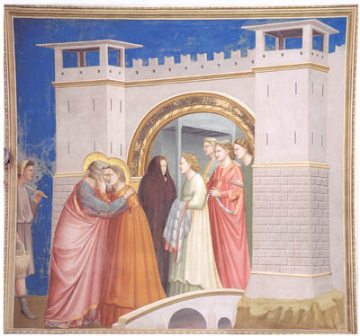
15. Giotto, The Meeting of Joachim and Anna at the Golden Gate.
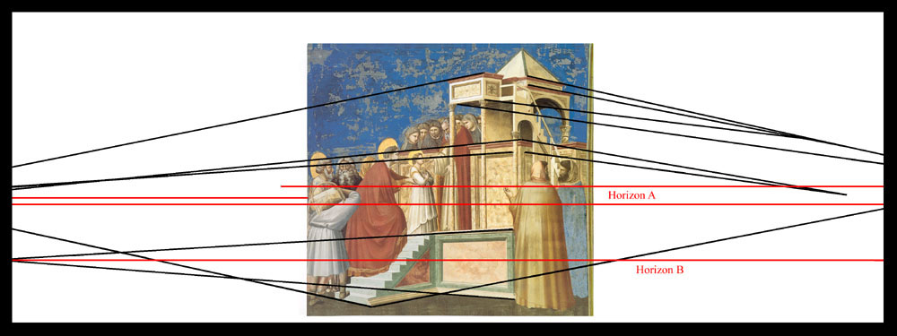
The same low horizon-like division of ground and backdrop is found in The Expulsion of Joachim. This immediately raises two questions relating to the latter. What is the literal reference of the blue background? It looks for all the world like sky, which its counterpart in the Meeting certainly is. Yet how can it be, with the edge of the ground so low? In both pictures the figures and the perspectival elements in the architecture imply a topographical horizon not lower than the midriffs of the figures. And if we must take the blue in the Expulsion to be an interior surface, following Paul Hills' 7 reading of the space as interior, based on the structures being interior ones, ciborium and pulpit as for instance in San Clemente , how can the base of the wall come so low? In fact it would slice across the enclosure! Why does Giotto favor such an anomaly? In this case the blue expanse may gain, as several commentators say, the thematic significance of an emotional void into which Joachim is propelled by the rejection of his offering, but Giotto's choice of a worm's eye view is by no means restricted to contexts where a specialized theme operates, as its presence in the Meeting shows. So it is relevant to search for an explanation based on the spatial effect alone.
Such a one is suggested if we compare the horizon in The Meeting at the Golden Gate with a transform that raises the horizon to accord with the dominant figural and architectural indications.
16. Transform of 15 with topographical horizon raised to suit the level of the figures and most architectural indications.
The transform incorporating this horizon shows how diminished the city walls become, and how uncomfortably sunk in the landscape they are. A similar aesthetic effect would result from raising the topographical horizon in the perspectival regularized Expulsion, as is shown by the corresponding transform of 5 -- placing the scene outside, that is. (17) I have not attempted to produce a viable interior background, where the problem of scale would be formidable.
17. Transform of 5 with topographical horizon made consistent with the perspective.
What I suggest is that a sufficient reason for the abnormally low horizon (or horizon-like division) is that it restores to the miniaturized upper architectural features much of their proper stature. And even more basically, it allows the foreground motifs to breathe by placing them against a void rather than against a receding ground.
5. Integration of individual spaces on the wall
Quite apart from questions about the coherence of the pictorial space within a given picture are issues relating to the optimum arrangement of motifs in pictures in relation to others on the wall. On the east or choir wall in the Arena we find a fascinating medley of arrangements (Fig. 18).
Left, 18. Giotto, the Arena Chapel east wall, with the color partly restored. Right, 19, transform of 18 flipping the Visitation.
On the second tier are the two fictive alcoves or chapels (coretti) that continue the space of the actual chapel. On the fourth tier at the springing of the arch is the Annunciation, in which Gabriel and Mary occupy buildings on either side of the arch that mirror each other. The orthogonals of these structures recede symmetrically in opposite directions to vanishing points (fictively) lying far outside the Chapel to right and left, thus forming two disjoint spaces. The effect, however, is to make the buildings seem turned toward each other, that is, toward the center of the wall. The orthogonals of the fictive chapels converge toward the altar, thus in exact opposition to those of the buildings of the Annunciation. They form one space rather than two. On the third tier are Judas receiving the 30 talents (left) and the Visitation (right), in both of which the placement of the diagonally positioned architectural structures suggests a recession to the right -- thus contrasting with the symmetry of the tiers directly above and below. Anyone sensitive to the aesthetics of formal arrangement must wonder whether Giotto's management of these arrangements is the optimal one. If it is the best, then why is it so? Only a close study of the four available options, which are but child's play to produce by digital transformation (19-21), can provide us with a well-founded aesthetic judgment. I will return to questions of this sort in the last section of the paper, 'Second-guessing Giotto.'
Left, 20. Transform of 18 flipping both the Visitation and Judas receiving the 30 Talents.Right, 21. Transform of 18 with only the Judas flipped.
6. Ambiguities of protrusion/recession
The oddity of the house-to-house Annunciation raises a number of questions. Taken literally it is most curious, since it represents the holy transaction as linking matching buildings on opposite sides of a street. That already strains credulity. Much odder is the fact that the structures are presented from widely different points of view, the left one from off-stage left and the right one from off-stage right. This has been noted in the literature 8 , although sometimes with suggestions 9 that the structures as angled toward each other , which they are not, since their fronts lie parallel to the picture plane. A third and quite striking effect of the whole is the seeming protrusion of the balconies into the space of the Chapel, which all observers note with approval and admiration. Let us consider these traits in turn.
The most basic feature of the design, the use of matching structures and intervening space, has perhaps been deemed too obviously salutary to require comment 10. It seems patent that on a formal level, matching structures are virtually a necessity. How else could the two columns of images be closed off so as to supply a uniform base for the heaven above? Given that Gabriel's annunciation to Mary is to be accommodated in this space, just below the dispatch of the angel on his mission, and given the required size of figures in relation to the available space, both structures must be employed, a consideration which is also consonant with the importance of the event and with the Chapel-wide scene above it. Further, given that Gabriel must be on the left in order to continue the narrative on the walls, placing the Virgin on the right allows God's fructifying radiance to fall in a direct line upon her as the announcement of the event is conveyed laterally from the left by His angelic agent. It also places the Virgin next to the continuation of her narrative on the right wall. These considerations understandably might trump naturalism of the mise en scène. This brings us to the (merely apparent) opposition of orientation of the structures. We find two explanations in the literature. First the angled forms of the design felicitously fill the available space between the curves of the two arches with the least possible occlusion by the outside arch 11. Secondly the design is said to induce the eye to glide more easily from side to side, intensifying the effect of transmitted messages 12. These are intuitively plausible, but need confirmation or correction by examination of the alternatives which cancel the opposition. For example, would the gazes of Gabriel and Mary be "hemmed in by the jutting balconies" but for the angled rendering, as White 13 surmises? A transform such as 22 can put this to the test. (For an enlargement of 22, click on the image and obtain 23.)
Left, 22. Transform of 18 with balconies of the Annunciation presented strictly frontally. Right, 18. The original repeated. Click on image to obtain 23, an enlargement of the top two registers of 22.
Finally, the apparent protrusion of the balconies into the real space of the chapel injects a quite separate dynamism into the whole. This effect, it should be noted, is not required by the drawing - indeed the drawing itself is evenly balanced between contradictions - but visually it is an irresistible "moment" of the design. That is, most though not all of our ocular fixations will contain an impression of protrusion. We are not likely to notice the distance cues that are inconsistent with this effect, most notably the fact that the curve of the outer (painted) arch passes in front of the foremost part of the roofs on both sides, as it could not do if the balconies extended beyond that arch. One commentator 14 proposes that the protrusion as a graphic symbol of the intrusion into the world of the deity in the miraculous conception. Perhaps there is merit in this, but it may also be doubted on the basis of there being no general practice in Giotto of symbolizing divine intrusions this way. And in terms of spatial illusion alone, is the protrusion of the balconies really more convincing to the eye than consistent recession would be?
These problems and hypotheses can be addressed more acutely by studying the alternatives to Giotto's image. The first (22 and 23) presents fully frontal views of the two buildings, the second (24) lessens the ambiguity of depth by providing a clear indication of ground lying in front of the base of the buildings, and the third (25) does the same for the frontal version of the scene.
24. Transform lessening the spatial ambiguity of the right side building of the Annunciation. Click on the image for 25, which does the same for the frontal version of the balconies (22 and 23).
Merely comparing the alternatives with the original does not of course automatically answer the questions of meaning and intention. But surely it provides the eye with more data to draw upon in forming, and testing, one's interpretations.
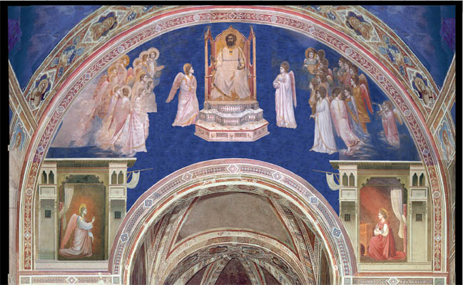
Giotto's fictive protrusions and recessions, consistent and inconsistent alike, in the Arena works are pervasively tantalizing, as we can appreciate if we study closely the upper section of the same wall. Fixate on the steps leading to the enthroned Christ and it is easy to feel the whole throne drift out into the viewer's space. (26) The sky offers no tangible assurance of its lying behind the arch or even behind the balconies of the Annunciation structures, although the crowd of angels on each side of the throne tends to restrain its protrusion when the shifting eye takes them into account.
26. Giotto, East wall of the Arena Chapel with color partly restored (detail). Click on the image for 23, the frontal view of the buildings.
Indeed, the more one dwells on the works the more equivocations one finds. Consider for instance the tendency of the inner band of the outer (painted) arch, as it rises beyond the Annunciation, to become an inner surface of a three-dimensional structure comparable to the actual triumphal arch. The constant shifting of the fictive forms seems to be an essential part of Giotto's appeal, forming a counterpoise to the much acclaimed, classic repose of the monumental figures 15.
7. Second-guessing Giotto
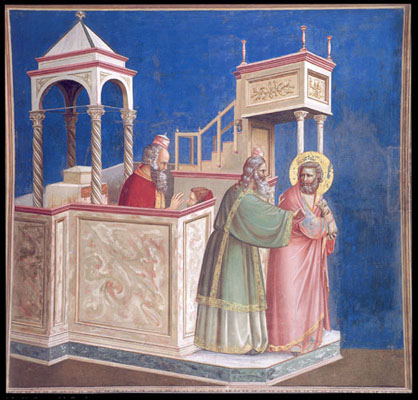
I have already posed questions concerning the aesthetic merit of Giotto's designs compared with that of alternatives. Here is a set of four options for The Presentation of Mary in the Temple: the original, a perspectival regularization to each of the two suggested horizons (27-28 ), and a partial ameliorization of the inconsistency of the original by leveling the porch of the structure, leaving all else the same (29).
Left. 3. Giotto,The Presentation of the Virgin at the Temple. Right. 27. Transform regularizing the perspective in 3 to the height of the figures and the indications given by the upper architecture.
Left. 28. Transform regularizing perspective of 3 to the horizon implied by the lower architecture. Right. 29. Minimal lessening of projection inconsistency by leveling porch floor, leaving the rest unchanged.
For my own part, I think Giotto would earn higher marks had he chosen the last (29). Anyone who prefers the original has the task of explaining why the downwardly sloping porch floor is a positive attribute within Giotto's own parameters. Any suggestions?
And finally I offer an arguably better alternative to Giotto's The Meeting of Joachim and Anna at the Golden Gate (30). Its space is far from consistent, since the wrenching discrepancy of ground level on the two sides of the bridge is not set right, nor is there any good way to do so. But much in the original has been regularized without loss of drama or grandeur. Can Giotto's original really be aesthetically superior to the transform, even within his parameters? Here is a nice problem for Giotto cognoscenti to ponder.

Left, 15. Giotto, The Meeting of Joachim and Anna at the Golden Gate. Right, 30. Transform of 15 regularizing the perspective to the lowest feasible horizon.
Throughout the foregoing reflections my main purpose has not been to gain your agreement on particular matters of interpretation and assessment, but only to pose unsolved aesthetic problems as eminently worthy of serious attention. In proposing that the enlightening potential of the additional data provided by the transforms be utilized my plea is simply this: How else can we ever do full justice to the myriad details of Giotto's artistic practice?
My general theme is thus the need for a reinvigorated address to aesthetic problems posed even by paintings that one may think have been exhaustively analyzed. Here, surely, is a down-to-earth way in which rediscovering aesthetics can produce tangible good in art history.
Notes
1. John White, Birth and Rebirth of Pictorial Space (1957, 1967,1987) and Art and Architecture in Italy 1250-1400 (1966), Ch. 24.
2. Alastair Smart, The Assisi Problem and the Art of Giotto (1971), Ch. IV.
3. James H. Stubblebine, Assisi and the Rise of Vernacular Art (1985).
4. I do not deny that the literature contains many illuminating comments about particular anomalies. On a larger scale there is a challenging explanation of the scrambling of modes, horizons, etc. in James Elkins' The Poetics of Perspective (1994) namely that painters at the time conceived of space in terms of individual objects rather than the spatial manifold as a whole. I find this thesis partly true and yet inadequate because it posits too radical a breach between inseparables. To produce any pictorial space the relations among objects must be set forth. Hence an overall spatial effect is necessarily produced. For Giotto and for us his pictorial spaces must register as somewhat strange and problematic wholes because of the inconsistencies.
5. White, op. cit.
6. The Annunciation in the Arena presents a special case of discrepancy where the full height of the buildings must be shown since the space of each is continued by the heavenly scene above. (See 18-23 and 26 below.) The conflict of scale within the two halves of the Annunciation is also sharper since the rooms extend all the way to the roof, as if the balconies are mere decorations. Here the overlap of discrepant scales is so great that no selective focus or attention can produce a passing reconciliation the miniaturized parts by making them seem farther off. In cases where a scene is isolated from the space of its neighbors by the frame, presenting only the lower parts of the architecture might reduce the comprehensibility of the scene. This could be tested by making appropriate transforms.
7. The derivation is widely acknowledged, but Hills ( The Light in Early Italian Painting (1987), 157n17) is exceptional in taking it, along with the dark color of the foreground, to indicate an interior space in Giotto's Arena Chapel works.
8. Samuel Edgerton refers to the two sporti as being rendered in the retardataire divergent perspective and ascribes to the painter the desire to heighten the viewer's perception of forward extension. But somewhat confusingly he says Giotto is updating this old scene according to his novel notions of perspective illusion. The Heritage of Giotto's Geometry (1991), 79 and 79fn 44.
9. As when White speaks of the sloping inner walls of the balconies. White 1966, 215. I grant that this is not definitive. Regardless of that, it is clear that if the buildings inhabited a single spatial system, as we certainly take them to do before we study them analytically, then the balconies would have to be turned toward each other. Analysis will then show that under that supposition they, and the building as a whole, must be rhomboidal, not rectangular, in plan, but that is a quite separate revelation.
10. The only explanation I have found of this is to the effect that such division of the scene has precedents in Byzantine and Italo-Byzantine representations (e.g. White, Edgerton, op. cit ). That is hardly an aesthetic explanation, but I don't doubt that art historians would explain the advantage of such an arrangement by considerations like the ones I mention.
11. White 1966, 215 notes the awkwardness of the space and the harmony of the angled design with the arches. To this he might add that Giotto's rendering also creates a wider and thereby more effective platform under the angels.
12. Ibid.
13. Ibid . I do not find White's hypothesis on this point confirmed by viewing 22 or 23. Instead the transmission between Gabriel and the Virgin runs undiminished through the intervening space, piercing the walls regardless of their angle. It seems to me that White confuses the protagonists' glances with the viewer's response to the whole. The seemingly angled balconies encourage the eye to follow the arch from side to side, the movement being abetted charmingly by the laundry hung on the poles at right and left falling closer to the arch in the original than in the transform and by the fact that the laundry's tighter curve than the hanging curtains' adds to the inducement. The eye, in short, is urged to travel in an arc across the space. But the glances of the angel and Virgin operate independently. They travel directly across the space, neither arcing up over the arch nor arcing out into the viewer's space.
14. Gary Radke, Giotto and Architecture in The Cambridge Companion to Giotto (2004).
15. Edgerton, op. cit. , speaks of the balconies as protruding dramatically. What might be called the optical drama of the whole range of spatial tensions, including all of the inconsistencies noted herein, deserves more minute study, in my view.